🔸5300 quality icons
🔸6700+ themed apps
🔸Properly implemented icon masking, brings uniformity to icons
🔸Unique icon shape, not found in Android™ Oreo/Pie or Android™ 10/11/12 adaptive icons
🔸Focus on details and creative design
🔸Consistent user support and updates
🔸Server based icon request tool
🔸Material Palette colors and gradients
🔸Custom made 80+ high resolution wallpapers
🔸256×256 hand-crafted vector based icons
🔸Dynamic calendar support [Dependent on Launcher and Calendar app]
🔸Folder, Generic and Alphabet category icons
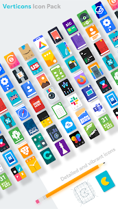
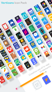
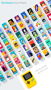
Bored of circular icons? Try something new…
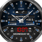
The tallest practical icons on the planet 🌍🌎🌏. Compliments your 18:9 & higher aspect ratio smartphone screens.
Verticons is a rectangular card material icon pack that loosely sticks to material design guidelines, tweaking them for a fresh user experience. In particular this icon pack avoids use of long shadow and makes extensive use of drop shadows and vivid colors.
For using alternate icons, long press the icon on your home screen and click edit [only available if your launcher supports it, eg. Lawnchair Launcher, Nova launcher, Smart Launcher, OnePlus launcher]
⚙️Recommended Settings🔧: Icon scale at 125% – 140% with icon size normalisation feature disabled. Use of higher column counts for app drawer and homescreen is recommended (5 or 6 columns are optimal depending on your smartphone screen size). For launchers and Android versions that support icon shape modification, please use a full square icon for better masking. Use square adaptive icon shape if your launcher supports icon shape editing
🔸Supported launchers include [but not limited to] :
Nova Launcher
Lawnchair Launcher
Microsoft Launcher
Smart Launcher
OnePlus Launcher
Action Launcher
Apex Launcher
Niagara Launcher
Evie Launcher
Hyperion Launcher
Next Launcher
Poco Launcher
ADW Launcher
Holo Launcher
TSF Launcher
Solo Launcher
Square Home Launcher
Go Launcher [no masking support]
All other launchers which support standard icon pack formats are supposed to work with Verticons, use the icon settings menu of your launcher which is usually accessed by long pressing on an empty space on your home screen. Use your launcher’s theme settings menu to check compatibility or to apply Verticons. An apply button appears inside Verticons for some compatible launchers. Some devices with System wide theme support also support Verticons (eg Custom ROMs, OnePlus OxygenOS)
Verticons uses blueprint dashboard by Jahir Fiquitiva and Pacific Request manager for icon requests


I love this icon pack. I’ve been using it since it launched. One thing I would like would be alternative dark icons for the dynamic calendar and Opera browser. I really would prefer dark alternatives for all icons, but I know that is a lot to ask. Edit: Thanks for the fast reply. I actually forgot about Monotone. I reinstalled it to use the calendar icon from it. It works better for my aesthetic. I had forgotten about that pack. It’s great as well.
This icon pack WAS amazing. It was my favorite pack to go with my Pixel Art live wallpapers but since the update on the 27th of October, it hasn’t worked right at all. I had to uninstall it. I use the ASAP Launcher and it was great with it but now I can’t use it at all anymore. Before, however, it was a perfect pack I’d recommend to anyone. Edit: I figured out the settings I can’t access in your app, I’m able to access through ASAP settings. I uninstalled, restarted, reinstalled your app, and went to ASAP settings in my upper right corner of my home screen to fix the issue. Looks great as always again 🙂 thank you
It is time to review this icon pack. I’ve never reviewed an Icon pack before but I’ve been using this one for at least a solid year, and longer on different phones. The consistency this brings is amazing, the free space in my drawer and home screen brings a clean look. I really can’t talk this icon pack up enough, I will probably never use another.
REVIEW REDUX This is almost exactly the icon pack I’ve always wanted. It absolutely BELONGS on my One Plus 7 Pro. Two things: certain icons seem “squatter” than others (Netflix and Chrome, at a glance) Could simply be my eyes, though. (Edit: after further investigation, it was my eyes) Is there any possibility of plain color options? That would make this a 5 star plus app. Thanks for your hard work, mate. You done a spectacular job.
Very clean, well designed icons. Everything is recognizable. Wish there were a few more alternates especially for common things like google apps. Overall very nicely done, different from stock but still not too out there where it looks weird or unrecognizable. Seems to have almost all my apps covered as well. Developer is invovled and responsive to feedback. Well done. edit:adding new icons is great, but changing ones I already have applied to something different isnt cool.
These amazing rectangular icons break the mould of traditional icons and immediately stand out from the crowd of repetitive packs that offer little, if anything, new. Most “minimal” styles seem to use the term as a guise for lazy design, however, this take on minimalism is actually extremely creative and packs personality into every icon! They are as refreshing as they are unique and give any possible style of Android’s UI a completely new breath of life.
Absolutely love it so far, the icons are beautiful too, but how come there’s multiple variations of icons and you can’t change between any of them? I don’t like the current icon being used for the app drawer button but I see no way of being able to change it back to the old variant. Would love the help, also good work!
Just switched off of an un-updated icon pack I’ve been using for years. The most important qualities in an icon pack are app coverage and design, and verticons is a pro is both. There’s a couple of options for the most popular apps, which is a huge plus too. Recommended!
To be honest, the only time I would normally post a review is when it’s negative; but this different. Lots of coverage on the icons & great selection of matched & tasteful wallpapers. I highly recommended this one!
No, it’s not a launcher issue. Tried clearing cache and reapplying verticons. Nothing works. Same thing happened with RAPIDO and KOTAKBANK icons. Edit(11-07-2022): Whenever I update the apps, theicons revert back to normal(some of them) and don’t turn into verticons later. This is annoying and worsens the experience. Please fix this.
No ads or subscription. really easy to use and looks 100 times better than the default icon pack.
Always on the lookout for decent icon packs, but think I’m sticking with this one. Love the designs and couldn’t be easier to install. Also got the monotone pack too, many thanks.
Best icon pack for Android. I have it installed on my OnePlus and it has made my phone look really good and modern. The icon pack stands out from the crowd. The quality of the icons are amazing. Do try it out.
Love this icon pack! I appreciate the little extra details on the themed icons — not necessary, but fun.
I got the free version from before. Im not sure if there is a difference between these two but im happy to pay for it even if its the same as the free version i already got. Good work, i love it. The best icon pack i have and seen so far. 😁👍
Pretty good stuff! A lot of icons covered. Actually most of my icons!! Amazing. Nice update too.
Really happy with this icon pack, looks really neat and tidy. Tried a few packs in the past but not been keen. Maybe it’s my OCD but I’ve always found circular/square icons on a rectangular screen look weirdly out of place and even worse when you have a mismatch of icon shapes, sizes and styles. This pack has icons for almost all the apps I use daily and they’re all instantly recognisable, and for those it’s missing it generates a border around the default icon to bring it to the right shape.
Hey, There is a bug in this app. My Telegram app icon suddenly goes to default icon pack. Can you pls fix this and make icon for BBC English Learning App too.
Best icon pack ever. Not just a reshape or a color pallet change. But actually well thought-out and complex icons. It’s one of the most complete packs there are, and it looks beautiful with any wallpaper. Tried so many others and I always come back to it. It’s just that great.
How often will you guys update apps . Looks and styles., Make work with good lock
Superb. A really well thought out design. I like that you mentioned that it’s tiring to look at circular icons because it is, and this is the answer to that. It looks modern and just over all pleasant to look at. Downloaded the free version initially, bought the paid version minutes later. Good job on this!
Incredible, I love the wallpapers inside, thank you very much, it is life🤳🌹
Unique and quite nicely styled icons pack.
Have to say that this is the best icon pack so far. Very customizable and much better than what Samsung’s One UI offers.
Paid Rs.60 for it but cannot install it as installation gets stuck at 99%. Tried for refund once and got it but second time unable to get refund also.
It’s so goood! I’ve used the free version for a couple of months, the experience is fantastic! I’ve decided to support my favorite Wallpaper/App Icon Artist by buying the full version of the Verticons icon pack! Not only is the full version of the icon pack has some even more NEAT and GORGEOUS icons, it also provide an enormous amount of masterfully designed 2D Vector Graphics wallpaper! I continue to hope you will bring more exciting creation to us! ☺️
Ever since I have used verticons, I have been in love with it. I just have one advice that I think will make this the number 1 icon pack. Let the consumers change the color of the icons for more personalization. Let’s say that the webtoon application is green but I want my screen to be all red. So if applied by verticons we can change it to red, simple but really a mind blowing feature. I hope that you could see this comment as I really think that this is a great idea.
Clean and fresh icon packs, good wallpaper to match the icons very well, works really great with Microsoft Launcher, the best so far
Best Icon Pack I’ve Used I ended up using this icon pack for over a year, the longest I have used a single icon pack. It’s also by far the most unique one I have used and I love the vertical look. On top of that, if an app isn’t themed, Verticons mask works and looks great. In fact it’s mask works better for unthemed icons than any other icon pack I have used. The develepoer updates icons semi regularly and takes requests.
Excellent new style. Vertical is just right on every level. Unique, different, stylish and ample icons for almost every app. Great search options for the app you might not like or want something different. TONS of icons and perfect for the “taller” phones. Great job dev.
Best Icon Pack! I love the look of these icons! With almost 5,000 unique icons and literal perfect icon masking – every single one of your apps (even brand new ones) will keep the same look and feel as the rest – and great wallpapers and more! The icons are simple, unique and fun! Definitely worth it, if you enjoy the icons looks and feel. This icon pack is the reason I got a 3rd party launcher so I could use them!
I love this icon pack. Plus the developer is so flipping responsive. Gave them a few apps to make icons for, very next update, rarely the one after that, the icons I asked for were there. Amazing. Unfortunately, I had to get a new phone, so I had the default launcher with my phones for a while. Hated it. Missed Nova. Now I’m back with Nova Launcher. Came back to Verticons, and I still love it. Thank you. If I could rate higher than 5 stars I would.
Best icon pack I’ve ever downloaded hands down. Looms amazing on the Microsoft launcher with some tweeking and kwgt.
Was a little skeptic but decided to try it. Wasn’t disappointed. Unlike other icon packs, it had icons for most of my apps. Usually a lot of my apps/games dont have their icons. There are still some icons missing right now but im not complaining. The developer has done a great job!
Outstanding app icons. The shape mirrors the “tall, skinny” phones OEMs are making right now. Colorful, well-done, and a lot of choices. It’s the only pack I have on my phone right now and I don’t plan on changing any time soon!
It’s amazing! The developer is extremely responsive. The unique beauty of the shape and design of this set, is only made better by the genuinely nice nature and speed to which icon requests are responded too. A true pleasure to deal with in this very impersonal world!
Edit: thanks for making almost all the icons up to date. Loved your support. Neat and clean icons. Loved them. But i am still not happy with the icons which are out of date and hasn’t been updated to the new icon colours (eg: signal Messenger, zomato etc), you can provide a way where users can submit request for the out of date icons so that you can update them)
Been using this for a couple of years, bought the pro as well. Well worth it in my opinion.
I have tried so many themes previously. But this one fits what I am looking for. I tried the free version before this, but then purchased this full version because it is priced less compared to the amount of work I can imagine that must have gone into making these. Thanks dev’s and please keep adding more icons if possible.
Lovely icon pack that covers TONS OF APPS! I’ve used dozens of icon packs before, and few of them have the breadth of verticons. And the masking for unthemed apps is FANTASTIC—never seen icon masking so convincing. My only problem is that some icons for *major* apps haven’t been updated to match their new branding (HBO Max, Google TV) but the dev said they’ll be added.